Seeing is Believing: The Power of Side-by-Side Color Palette and Hue Comparisons
Have you ever taken an online color analysis quiz only to end up more confused than when you started? You’re told you’re a “Soft Summer” or a “Deep Winter,” but the results don’t explain why. Worse, they don’t show you how those colors actually look on you. That’s the problem with many online color analysis tools: they rely on abstract categories rather than letting you visualize how colors interact with actual clothing in actual settings. That’s where side-by-side color palette comparisons change everything.
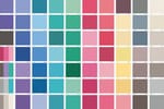
The Flaws of Digital Overlays: Many tools rely on digital overlays or color blocks to “drape” you virtually. The issue? These overlays flatten color and ignore depth. They don’t account for how light interacts with your skin tone, how a shade enhances (or dulls) your natural features, or how real clothing fits into the equation.
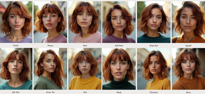
Think about it: a block of “Soft Teal” might look pretty in isolation, but does it harmonize with your complexion? Does it make your eyes sparkle? Or does it fade into the background? That’s the difference between theoretical color analysis and real-life visualization. Our tool bridges that gap.
Bringing Your Palette to Life: With our True-to-You Lookalike color analysis tool, you can see how colors work in practice. Instead of vague “theories” or rigid rules, you’ll see your lookalike styled in real clothing, under real lighting scenarios. Want to know if “Flax” or “Soft Teal” is better for you? Compare them side-by-side and watch the difference. Curious if your eyes brighten with “Rose” or “Thistle”? Now, you’ll know.
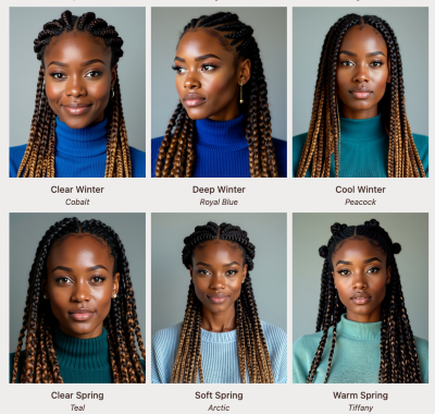
By seeing these effects in real clothing rather than abstract swatches, you’ll feel confident knowing which shades bring out your best features.
Confidence Through Clarity: There’s power in being able to see the transformation. You no longer have to guess or wonder if you’re really a “Soft Autumn” or if that color you’ve always avoided might actually look stunning on you. The ability to test colors in real-world contexts removes all doubts. You get to see, firsthand, how the right shades enhance your natural beauty—and that clarity transforms your confidence.
The Emotional Impact of Visualization: Choosing colors is about more than appearance. It’s about feeling seen, understood, and empowered. When you visualize your best colors, you’re not just building a wardrobe—you’re building confidence in your everyday choices. You’re creating a reflection of who you are and how you want to show up in the world.
Seeing is believing. Real-life color visualization takes the mystery out of color analysis, giving you the tools to make choices with confidence. Whether you’re starting a style reinvention or simply looking for shades that make you glow, our tool helps you bring your palette to life in ways that feel effortless and true to you.
Don’t settle for theories—see the results. Let’s explore your colors together.