Why Undertones Matter (Or Don't) in Modern Color Analysis
Undertones have long been a cornerstone of color analysis. "Check your veins," they say. "Are they green or blue?" This classic advice is meant to reveal whether you lean warm or cool, and it’s often treated as the ultimate key to unlocking your best colors. But is this the full picture?
According to a growing wave of skeptics and experts, undertones might not be as foundational as we've been led to believe. Some argue that relying on oversimplified tricks like vein color or other surface-level indicators misses the mark entirely when it comes to finding what truly makes someone shine. So, where does the truth lie? Let’s break down the debate and challenge the myth of undertones.
The Traditional View of Undertones
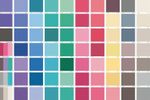
For years, color analysis has centered on categorizing undertones into three types: warm, cool, and neutral. The idea is simple:
- Warm undertones are thought to pair best with earthy hues like golden yellows, warm oranges, and olive greens.
- Cool undertones are said to thrive in icy blues, jewel tones, and cooler pastels.
- Neutral undertones—considered rare—are thought to balance between the two, pulling from both palettes.
Tools like checking your veins, seeing if you look better in silver or gold, and the infamous white-paper test have become gospel in determining where you fall. The assumption? Once you identify your undertone, your color destiny is written in stone.
The Problem with "Undertone First" Analysis
But what if this approach is oversimplified? Critics of the undertone-centric model raise a few critical points:
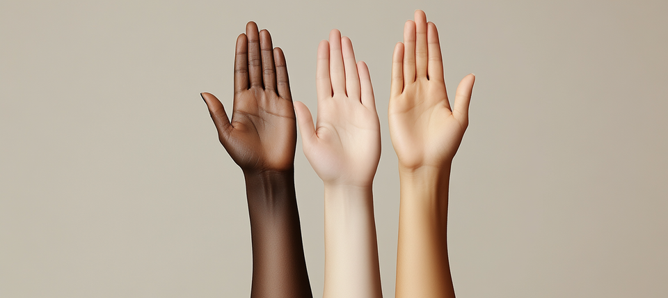
- Vein Color is Inconsistent: Veins are influenced by lighting, skin thickness, and even individual perception. What looks green to one person might look blue to another.
- Undertones Don’t Always Predict What Works: Have you ever tried on a shade that “should” suit your undertone but made you look washed out? Turns out, colors interact with skin tone, eye color, and hair tone in more complex ways than undertones can account for.
- Contrast and Depth Matter: Critics point out that contrast (the relationship between your features) and value (lightness vs. darkness) often have more impact on how colors flatter than undertones alone.
- Dynamic Context: In real life, we don’t exist in “neutral lighting”—the environment, makeup, and even emotional connection to colors all influence how we feel about what we wear.
A New Approach: Let the Colors Speak for Themselves
Here’s the alternative: Instead of spending hours debating whether your veins are green or blue, what if you experimented with actual colors on your body and face? Seeing how hues interact with your skin, features, and personality is far more revealing than chasing theoretical undertones.
Imagine trying out a range of shades—soft pastels, rich jewel tones, earthy neutrals, bold brights—and observing their effect. Maybe that cool periwinkle enhances the clarity of your eyes, while a warm terracotta makes your skin glow. Suddenly, it’s less about the “rules” and more about real results.
Why Our Tool Encourages Exploration
We’ve designed our color analysis tool with exactly this freedom in mind. Instead of boxing you into categories based on abstract undertones, we encourage you to explore entire palettes. By focusing on the actual effect colors have on you, the process becomes one of discovery, not limitation.
This means:
- Seeing colors side-by-side in real clothing scenarios.
- Experimenting with hues across warm, cool, and neutral spectrums without preconceptions.
- Finding the shades that make you feel confident, vibrant, and authentic.
The Takeaway: Break Free from the Undertone Myth
While undertones can offer some initial guidance, they’re far from the be-all, end-all of color analysis. Your relationship with color is dynamic, and the best way to understand it is through exploration. Don’t let the debate over warm or cool hold you back from discovering what truly lights you up.
Ready to See What Works for You?
Dive into our online AI color analysis tool and experiment with a variety of palettes. Skip the labels and focus on what makes you feel radiant. It’s time to let go of rigid rules and embrace the adventure of discovering your personal palette.